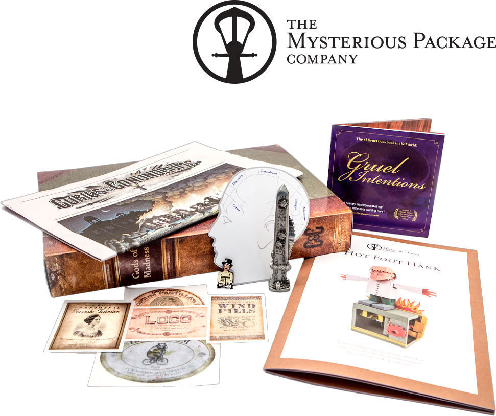
The Mysterious Package Company creates adventures that put you at the center of the story. We deliver experiences by mail in the form of puzzles, stories and collectibles.
My Role
Direct all aspects of UI and web development
User testing via A/B split testing
Leverage user data to improve UI and UX
Rebuild the flagship eCommerce store on Shopify
Establish external partners and design agencies
Results
Significantly reduced fulfillment times by automating multiple processes via new website
New design system streamlined design decisions reducing decision time from 1-2 weeks to 1-2 days
Improved conversion rates by 15%+ on average
Successful landing pages and supporting social ads that generated $30-50K daily in direct sales
Problem
It’s been over 5 years since The Mysterious Package Company (MPC) built their own flagship ecommerce website. It’s a little tedious to maintain and an overall clunky user experience. The fulfillment process has many variables, many of which can be automated giving MPC more time to focus on what matters. It’s time to refresh and up the ante.
Goals
Evaluate MPC’s entire setup including front end, back end and fulfillment while identifying areas of improvement and potential automation. Use this knowledge to develop a more efficient user flow and find a suitable well-supported platform to build on. Beautiful aesthetics and polished functionality are of the utmost importance. The Mysterious Package Company is very detail-orientated (so are their customers) and their products are meticulously designed. Reflect this in their new website.
Process
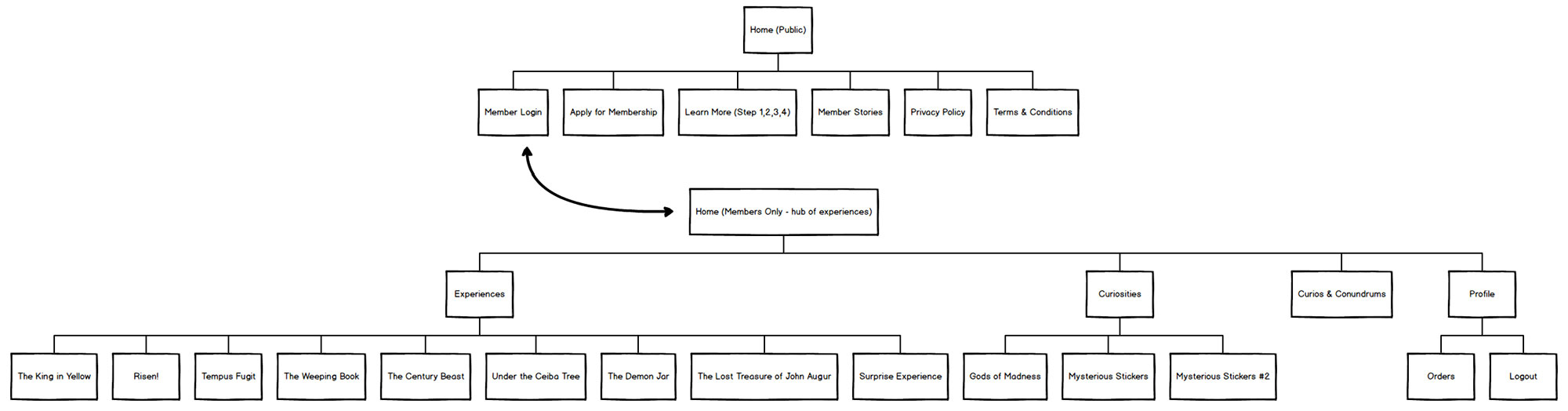
Step 1: Evaluate current sitemap + user flows
I start by mapping all of the pages and paths the user may take to visually make sense of a cluttered situation. This type of presentation is visual, making it easier to discuss the design and the functions of the platform with the client during the process.
Old Website: Front End User Flow
Old Website:Back End User Flow
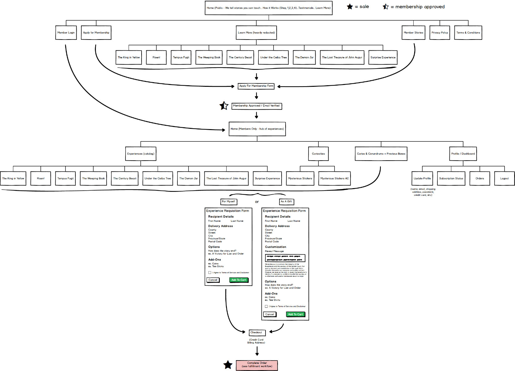
Step 2: Identify opportunities to simplify + create new sitemap
Minify and combine steps of the user flow with a focus on automation to improve click funnels and the overall user experience. By constructing a sitemap with a clear goal in mind we create the driving factor to the website’s success. It becomes clear at this point that the best platform to build on is Shopify due to it’s well supported, robust ecommerce content management system and ability to integrate our own custom fulfillment app.
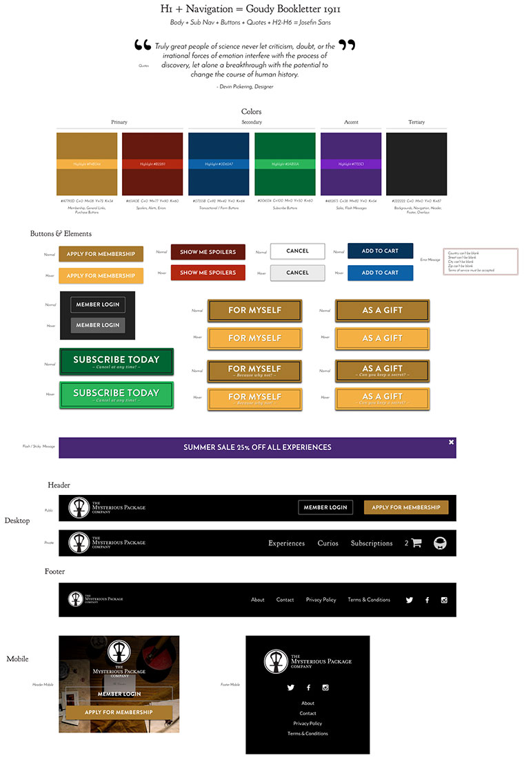
Websites of this size are always best to start with wireframes to ensure we engage every touch point. Using wireframes to establish the main components, I designed a system of graphics and symbols including colors, typography and core UI elements to ensure consistency throughout. This is followed by prototypes putting it all in action.
Desktop wireframe
Preliminary design system to establish consistency
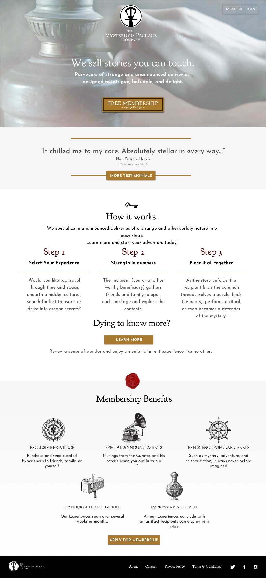
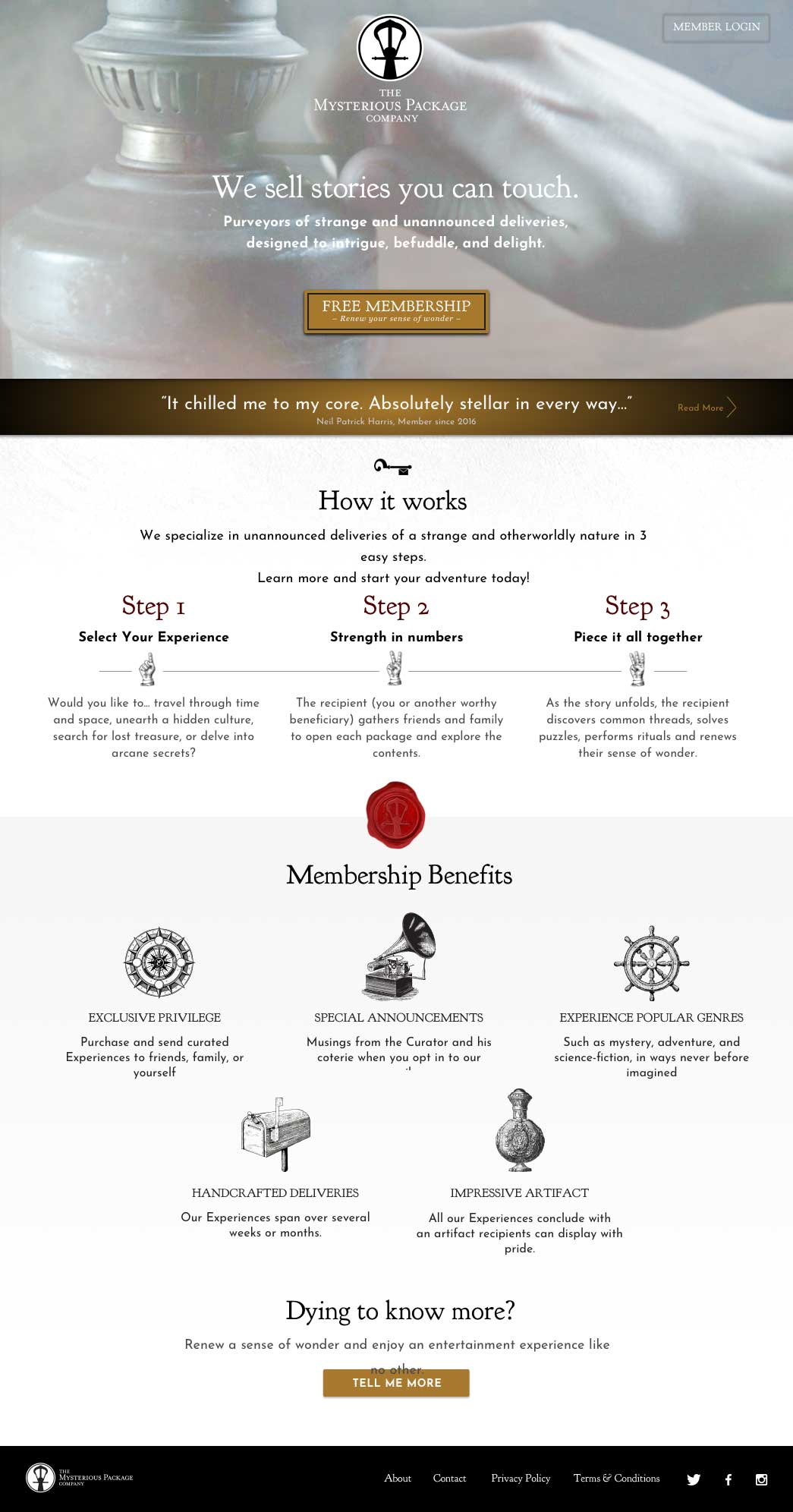
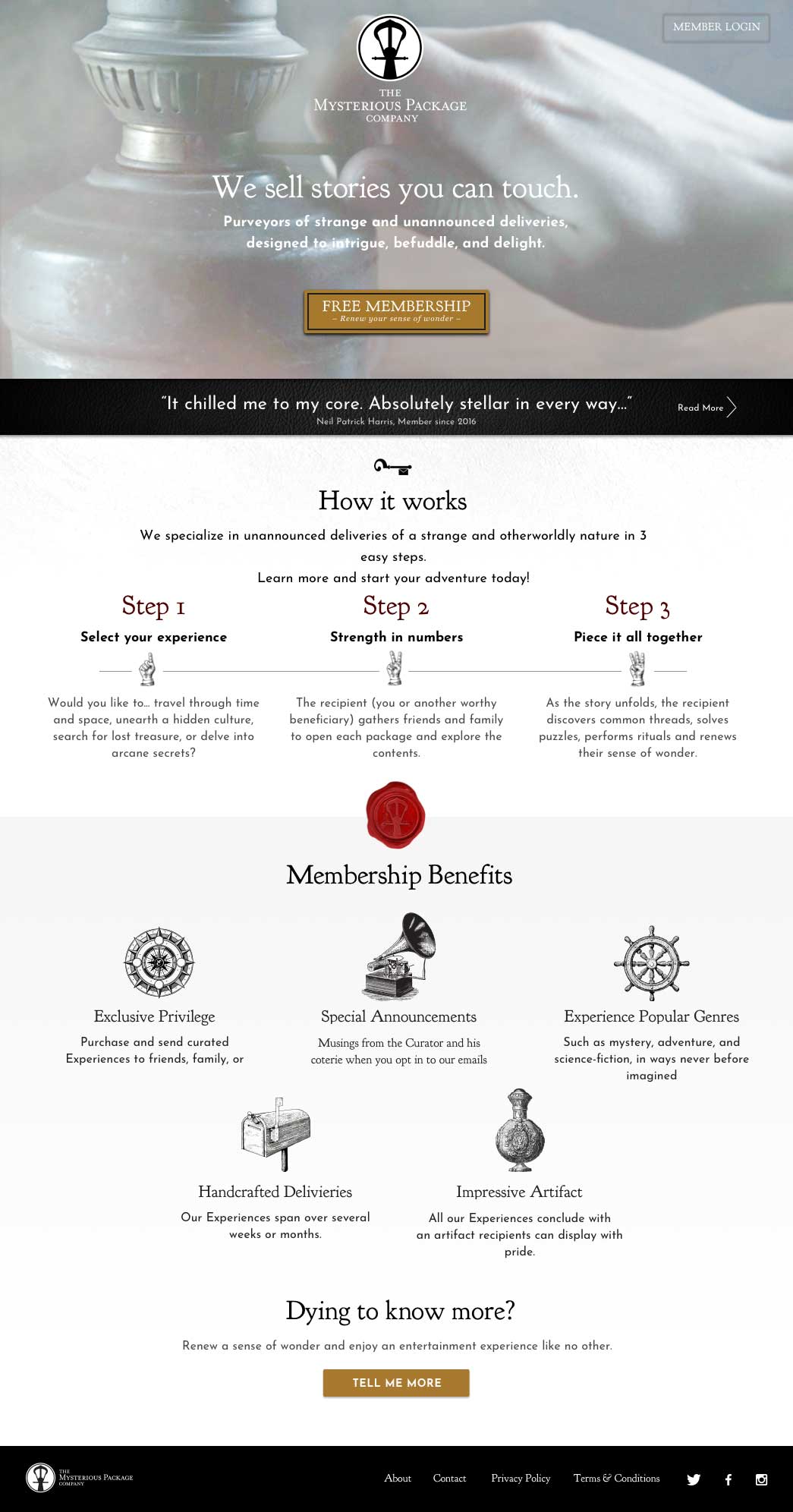
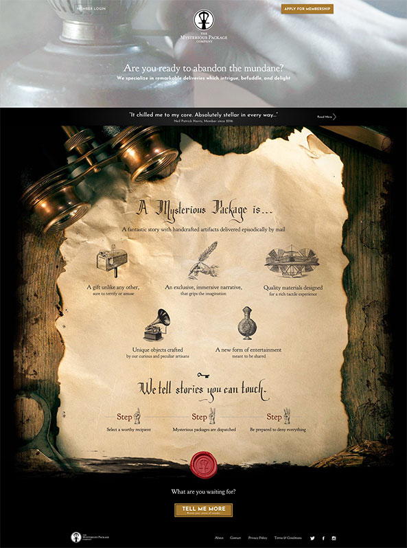
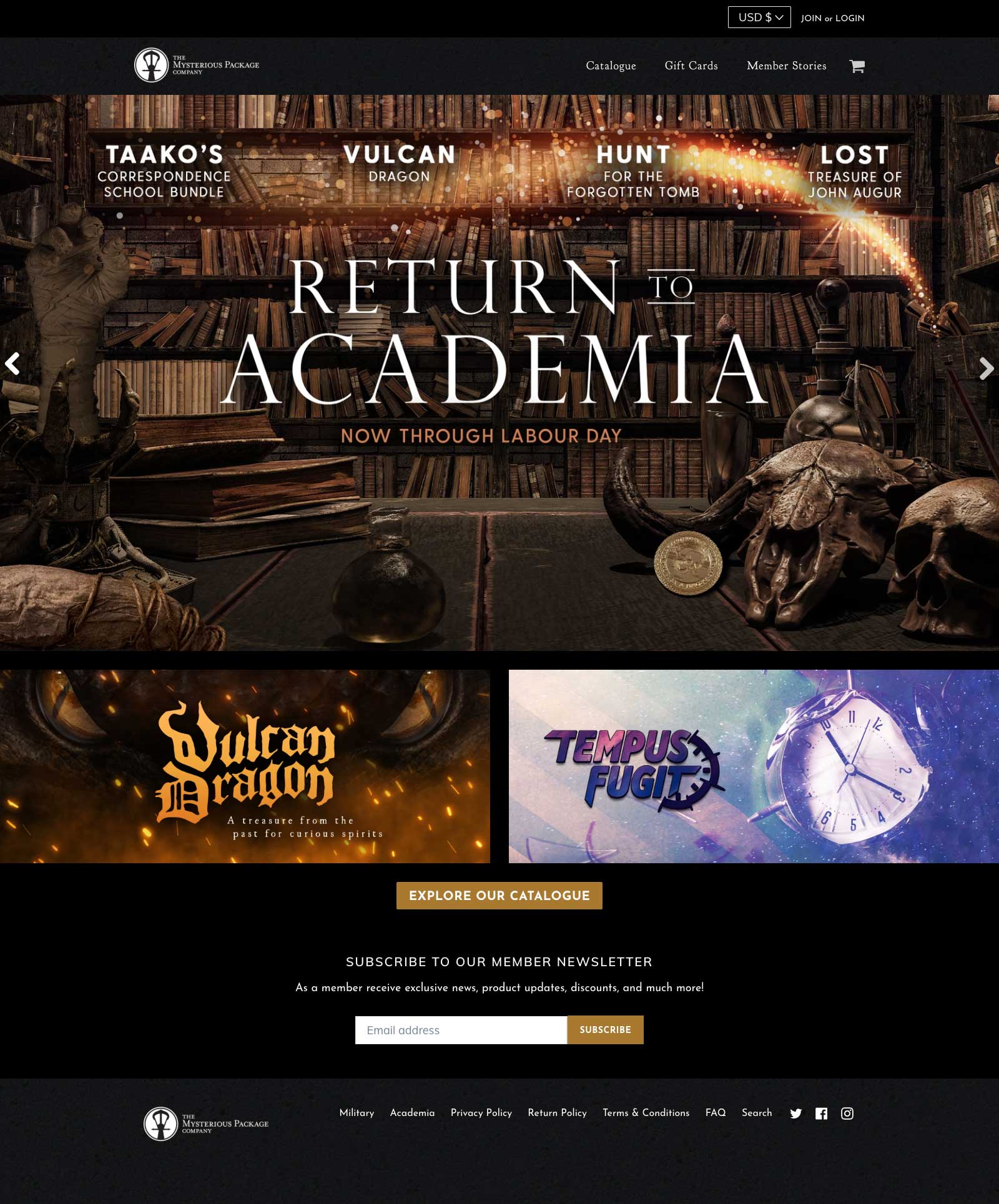
Desktop home page design iterations
Mobile home page design iterations
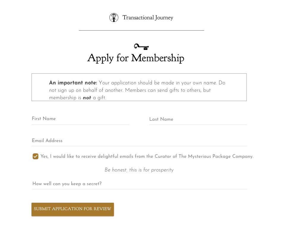
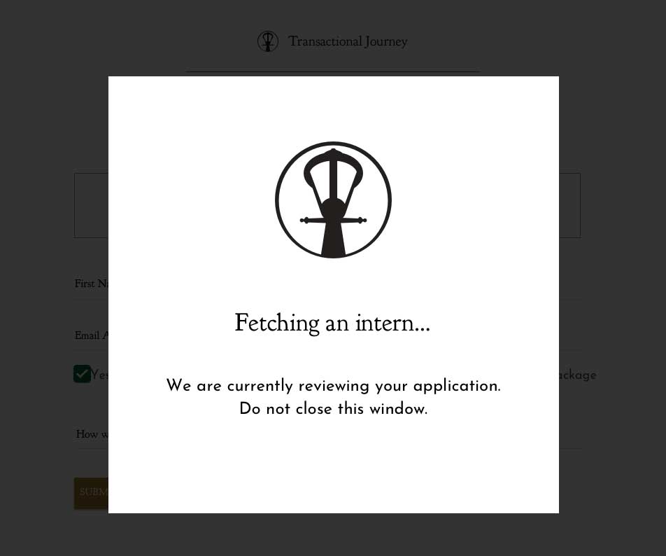
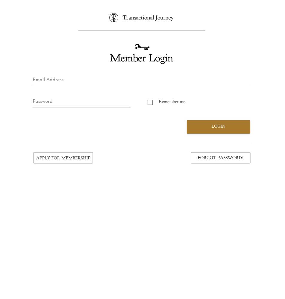
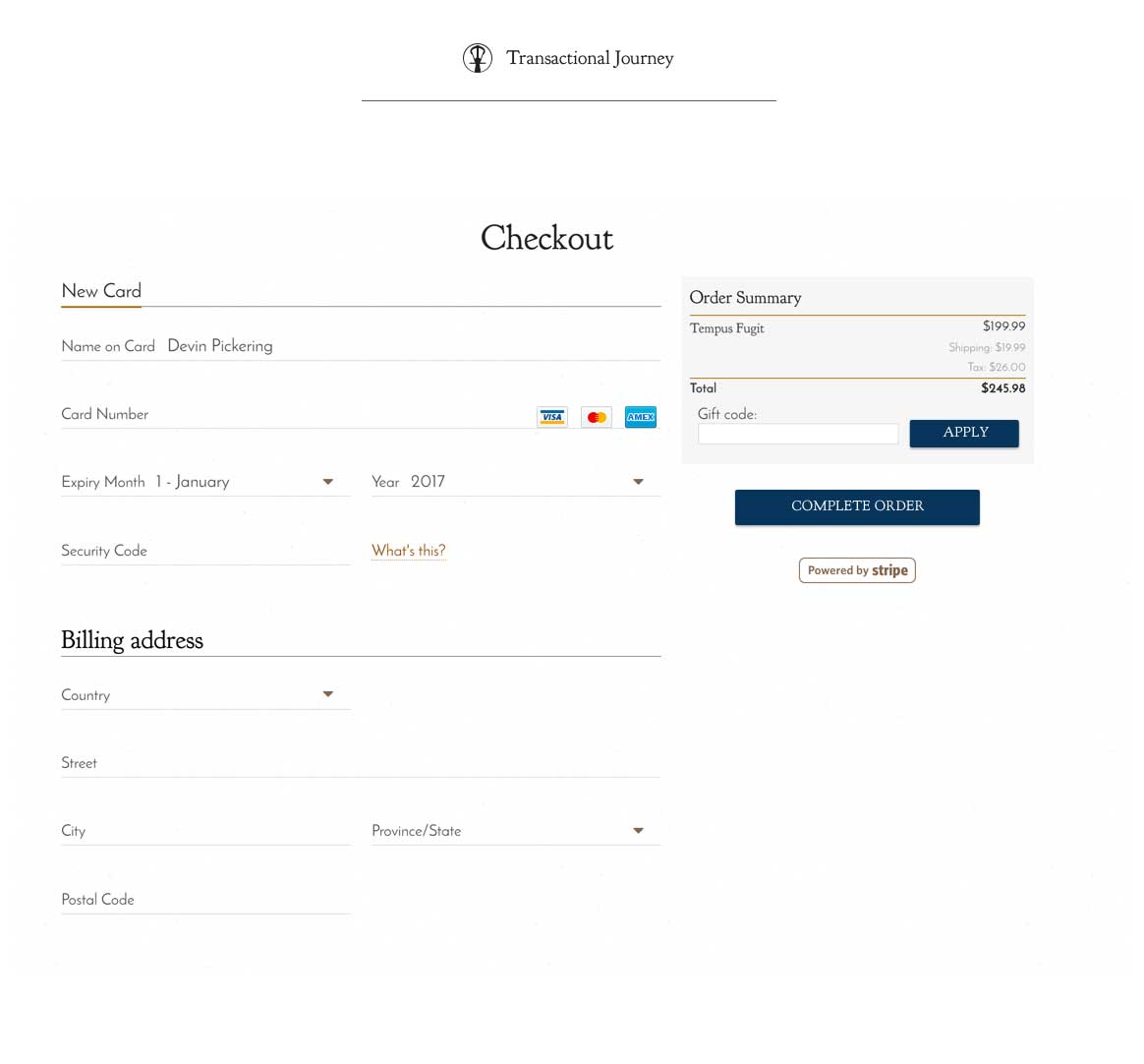
Transactional User Flow
Landing Pages
Member Subscription Landing Page Iterations
Product Landing Page (generated 35-50K/day in revenue with 5K/day ad spend)
Shop Page
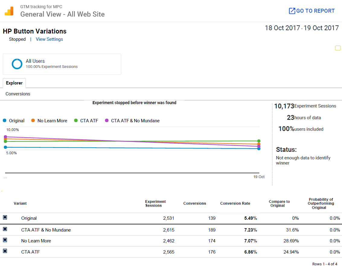
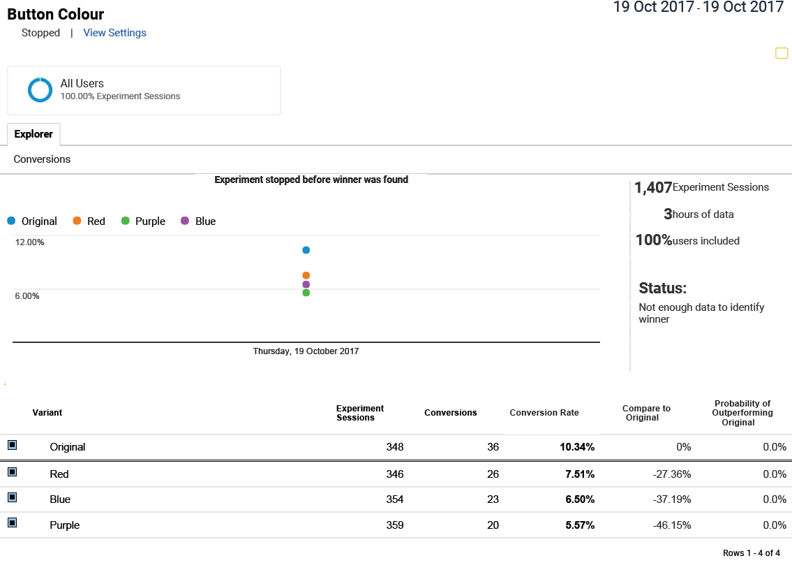
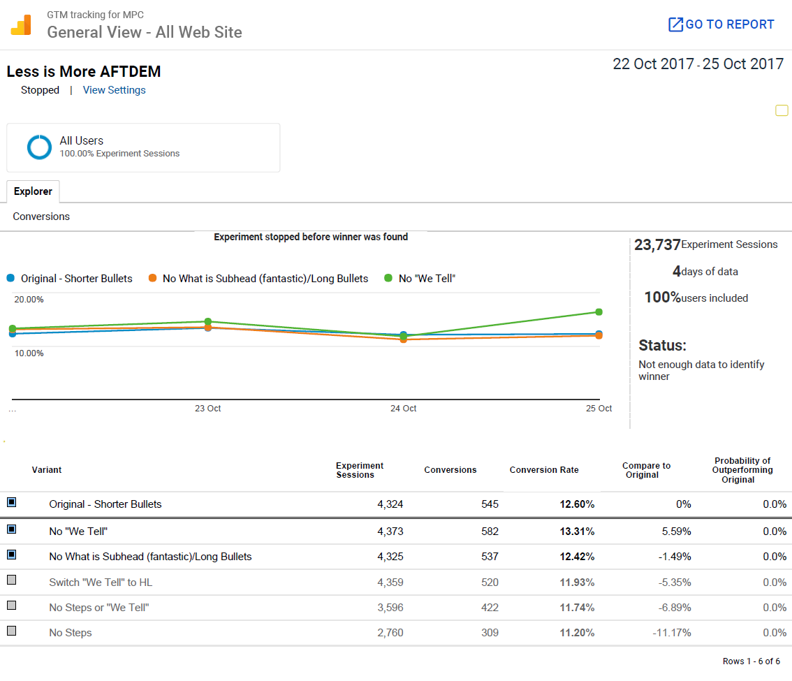
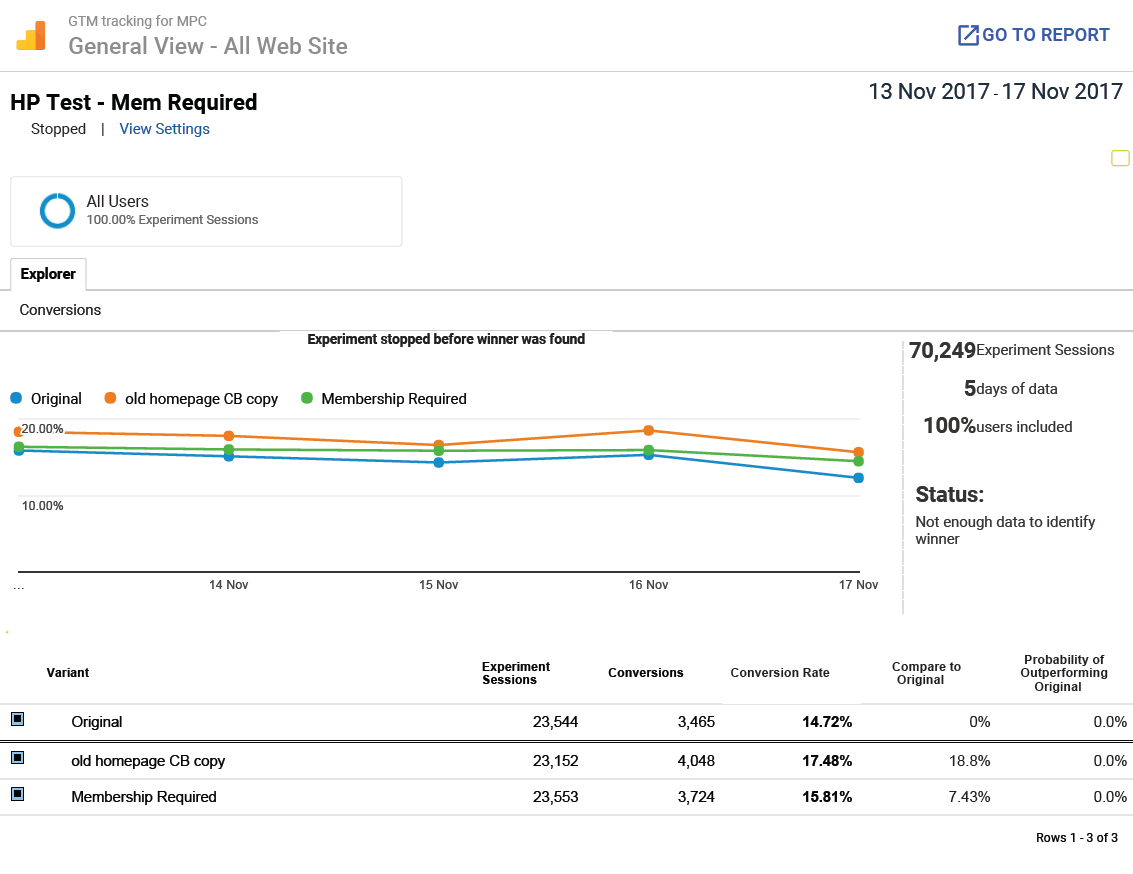
Step 4: Test + Revise + Repeat
The website has launched. Now it’s time to experiment. I use data to drive my design decisions.
Utilizing Google Experiments (now called Google Optimize) for A/B testing, I consistently improved conversion rates by 3-5%+ on average weekly over the span of 4 weeks.
Results
The functionality, design system and custom fulfillment app that was built inside the website has dramatically reduced fulfillment timesby automating multiple processes while providing an efficient user flow for both website visitors and admins resulting in a better user experience.
The home page after numerous A/B tests to incrementally maximize conversion rates: